Over the last few years, we’ve seen an increasing amount of attention turn towards mobile design and development. This is to be expected with the new hi-resolution screens and device abilities that have appeared on the market. The focuses of these conversations are about how we should limit our designs in the mobile space. How we have to scale back. I think we’ve got it backwards. I think we’re able to connect our designs with users at emotional levels we’ve never been capable of before.
Emotions drive our interactions with the world around us. They create experiences. Sometimes these experiences are pleasurable; sometimes they are frustrating. But they are a driving force behind how the Earth operates. We as humans put a great deal of emphasis on our emotions through the day. Without emotion, we wouldn’t want to have any experiences. We would be bored and uninterested in the world around us.
So why then do we create emotion through our desktop designs and neglect these emotions when it comes to mobile environments. Since we have no control over how users are going to view our designs, we have to make sure that emotional connections are present.
Emotional Design
I first heard the term emotional design when reading the Design for Emotion book by the talented Aaron Walter. I realized that this was a design practice I had been utilizing for years but just hadn’t given it a name yet. I started to notice this more and more in other people’s desktop designs as well. But then saw that things fell apart when it came to mobile experiences. I found this troublesome. Why were we restricting ourselves and throwing away all of our hard work when we dealt with mobile.
With the capabilities we are presented with on iPhones, iPads and Android devices there is no reason we shouldn’t be connecting with users on an emotional level here as well. Also there is a lot of talk about hiding elements in responsive design. This makes sense when it comes to offering a focused message but should we lose the personality and connection we’ve established in our desktop versions? I think not. There is no reason a responsive design needs lose its personality just because it’s in a smaller screen. In fact, your sites or apps should have more personality shining through in these smaller devices.
Because mobile is such a personal medium, more so than any other medium we’ve designed for, we need to learn to focus our messages but still connect with our users. In this medium, we can indulge senses that we’ve never been able to active before like touch.
Polite Gestures
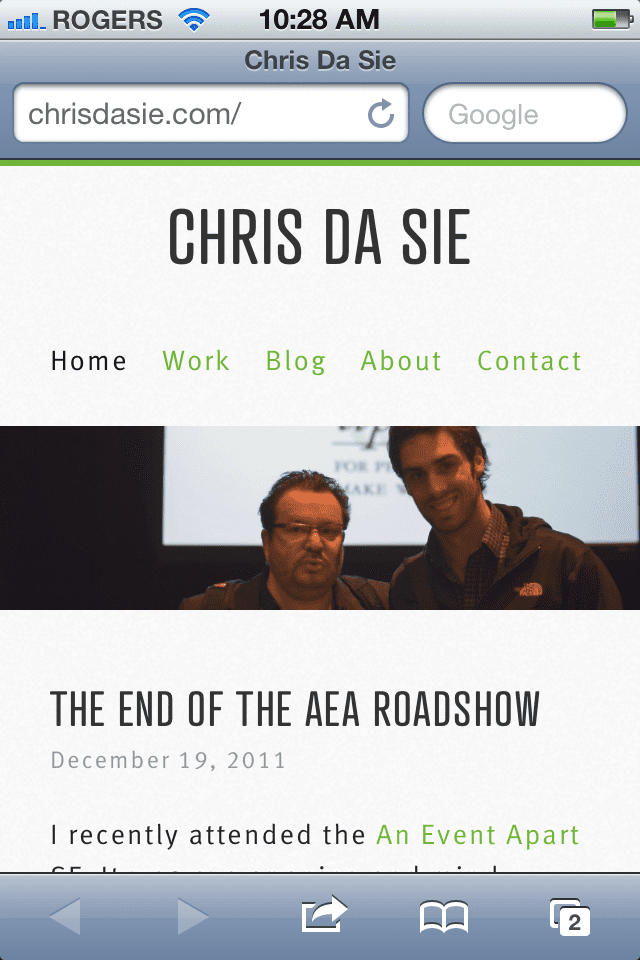
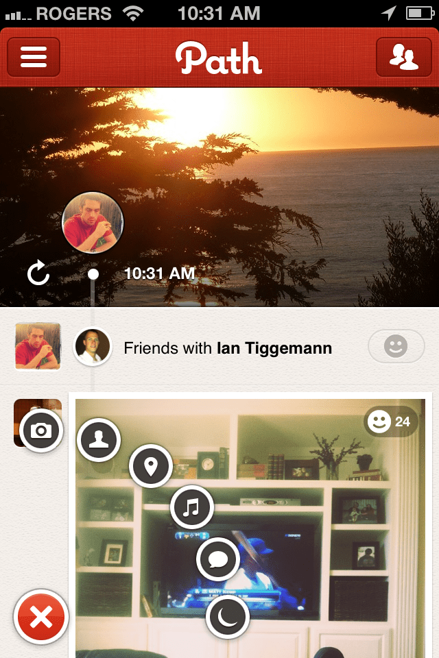
Gestures can go a long way in how users feel towards our sites. For example, why include a simple navigation option like I have on my site here when you can something incredible like the navigation offered in the app, Path.


The left to right page slide and the small plus icon don’t just make it easy to navigate around the app but actives the user’s sense of touch. It engages the users to do more than just click a link or share a moment. It makes the user feel like they are a part of the experience. There is nothing new to learn. Users feel comfortable with this experience without any special instructions. This ties in with our need for simplicity and ease when navigating content in the digital space.
Through simple approaches like navigation changes we are enhancing the experiences of mobile browsing without distracting from the focus messaging we’ve established in our designs.
These types of navigation tools aren’t restricted to apps either. So there is no need to begin the debate about native app vs. mobile app. We can achieve these connections right now. Developers have been experimenting with this type of navigation through the use of javascript libraries. They are accomplishing some extremely beautiful intuitive forms of navigation.
It Takes Too Long
One of the other rants I’ve been hearing around the web about the lack of emotional design in mobile use is that it takes to long to code. I’ve saw hear along these same lines that no one really browses on their smart device. That’s what laptops and desktops are for. This is just completely untrue. We have so many amazing frameworks that we can utilize these days like 320andUp, Skeleton and Foundation. There is no reason why designing mobile first should not make your development time quicker and simpler.
If the strategy for the site or app has been carefully crafted and organized then it should be easy to start with your mobile first design. This gives us as designers an opportunity to embrace the emotional connections we want the user to have with our work starting from the ground up. It’s not a special line item that we should be charging our clients to have. It should be expected like cross browser testing.
The emotional connections you can create in a smaller screen size are only going to get stronger as the site enhances with larger screens. So don’t neglect this opportunity. The growth of mobile browsing is growing at rates beyond our greatest imaginations. So you might currently live in a region that doesn’t have a lot of mobile use but that doesn’t mean it’s not there and that it’s not growing daily. Take this into consideration when you think about making sites future friendly.
Conclusion
If we want our users to be connected and engaged in our designs, we need to remember to include our emotional connections in all screen sizes. Mobile browsers are not the time to scale our designs back so far that we leave our users uninterested and bored with our content. It is a time to engage new senses and create experiences that users will carry with them through our content.


