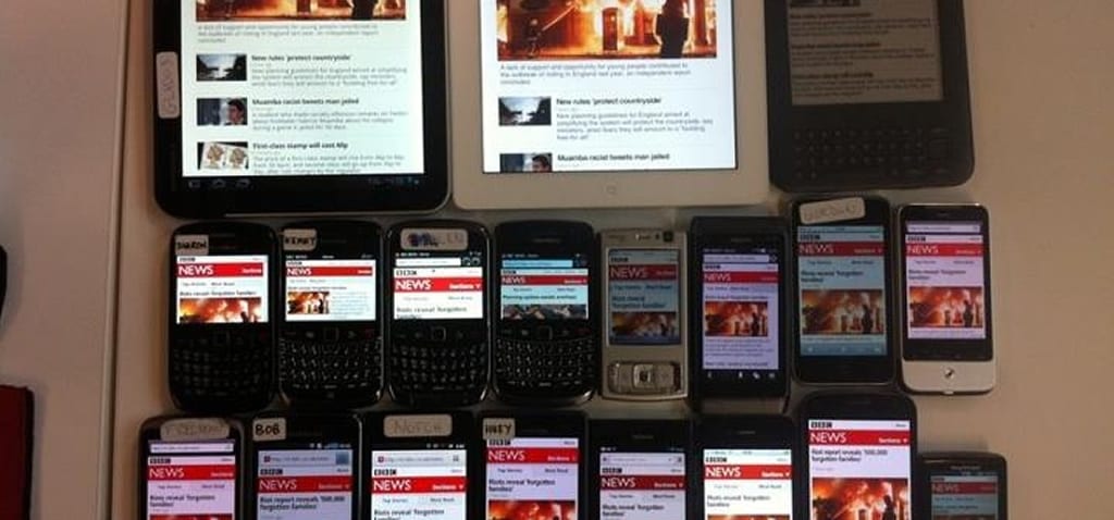
There is a lot of talk around the web about always have a responsive design for any web project that you create. But one thing we never seem to talk about is how to actually design for this space. So people are doing an amazing job of this like Think Vitamin/Treehouse, Simon Collison to name a few. But what really makes these great and easy to navigate through.
Well it’s the spacing and size of buttons. So often we talk in desktop screens about hierarchy and whitespace around elements, but when we get into our responsive designs all of this can change. We navigate responsive designs differently. We’re using our big thick fingers to click on buttons and navigate information. So then why when we design for these smaller screens do we also make the buttons that much smaller.
You might say it’s because we are working in a screen size of 320px and other various sizes. But that just means that you need to review the strategy we’ve developed and user experiences we want to create. Yes you are in a 320px space but this just means that less is more. Don’t make your buttons smaller so that you have room for a thousand other things. Reduce the amount of content you have so that you can fit those buttons in there. If it’s a site with a significant amount of images then maybe you reduce it down to 3 or 4 than than 20. Small touches and quick evaluations of your strategies will go miles with how the user sorts through your content.
We need to start looking at making these buttons bigger. We need to take on new perspectives in regards to our hierarchies. Our user experience will greatly improve if we are just make navigation easy. We can still have our whitespace around elements. But we need to judge the sizing different. This might mean you add some extra padding around the button text or maybe you center the button in the screen rather than floating it right or left. Just make it easy for that user.
Like most I’ve fallen into this trap a few times. Thinking that if I make that button and bigger then I’ll lose the detail or elegance of my design. But in the end, designing that button to be a bit bigger always helped and created a better user experience. By doing this I was able to remove concern from my clients and myself that the user would click and get lost in content they didn’t actually care about. Sure the time spent on these new pages would be great from an analytics standpoint but would that user ever return knowing that they had such trouble navigating to the information they wanted. Probably not.
So I ask you to all consider this when creating your next responsive design to make buttons bigger for your user. You might think it’s the wrong way to go but your user will be forever grateful if they can navigate your content more easily.


